CMS Spy
Websites we love!
We're thrilled to announce our monthly Website series where we'll dive into the digital world of venture capital! Each month, we'll explore and analyse three VC/PE websites, focusing on their design and branding, essential VC or PE elements like team, strategy, portfolio but also responsiveness and speed as well as SEO strategy (that is - website visibility on search engines).
Venture capital or private equity firms who want to climb higher need to work on their pitch decks, their social media presence, and, fundamentally, their websites.
The purpose of this series is to provide insight into how top VC/PE firms present themselves online and what sets them apart from the rest. Join us as we uncover the secrets behind their successful websites, offering insights and inspiration to anyone interested in learning more about the digital side of VC/PE. 🚀
Why is it Important for a Venture Capital Firm to Invest in a Good Website?

A team’s website is much more than just a part of their online presence – it's a vibrant hub of activity. It’s where the essence of their investment strategies and successes are showcased, ideally acting as an organic magnet for innovative entrepreneurs and savvy investors.
Think of it as a doorway into the vision of the firm, sharing insights and celebrating achievements via visual cues and branding.
Check Out These 3 Venture Capital and Private Equity Websites We LOVED! (November 2023 Edition)
Here are 3 great venture capital and private equity websites we handpicked this November which really stand out for their excellent design, functionality and content 🎉
Vidia Equity showcases a sleek approach to a PE website through its functional design delivering a clear core mission of green investment as well as acting as a polished and informative online resource.

Design and Branding
Stepping into Vidia’s website, you’re greeted with an environment that’s both stylish and purpose-driven with a touch of geometric design elements, accentuating the use of minimalistic but intentional branding.
Through a dedicated branding strategy and functional design, Vidia managed to harness a mix of modern simplicity and a clear commitment to sustainability. The website elegantly showcases their mission “to scale climate solutions,” creating an immediate connection with their ESG agenda.
PE Elements
Delving deeper into more PE-related sections: Vidia’s “Strategy” and “Impact” pages provide a transparent look into their mission and investment thesis, leaving no LP or founder in ambiguity. Meanwhile, the “Blog” section reinforces their sector expertise as well as boosting their search visibility through keywords and cohesive content marketing.
Responsiveness and Speed
The mobile experience of Vidia’s website is seamless with their consistent branding coming alive in a smaller screen size. The subtle animations during page load and a sleek navigation function add to the elegant design aspects and 10x the user experience.
SEO
In terms of on page SEO, Vidia Equity seems to have a solid grasp. Their content strategy, focusing on sustainability and climate solutions, aligns well with relevant keywords in their field. This strategic approach enhances their visibility to the right audience, ensuring they are easily discoverable both by LPs interested in sustainable investments and companies embellishing the same vision.
Now hold on, this is about to get slightly more technical. Stay with us 🤓
The website makes good use of descriptive link text, which is crucial for user experience and SEO. The images are properly described and the presence of a valid 'rel=canonical' tag means they are successfully preventing duplicate content. We found no outdated plugins, making for great compatibility across devices.
If you're wondering what all of this means, or want a free SEO audit of your website
Vidia’s website runs on WordPress along with Elementor. It’s a winning duo!
Want an awesome website on your own but not sure where to start?
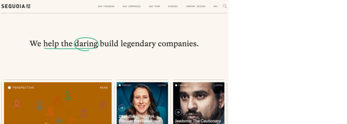
Ok ok, we know. EVERYONE in and out of the VC space, not living in space (or maybe even living in space) has heard of Sequoia Capital. It’s no surprise that, as one of the biggest players in the industry, they boast a nice-looking website with an awesome UX. However, it might be a relief to read that what they achieved with their website is not rocket science, nor does it take out half your fund budget.
Sequoia Capital’s website effectively combines elegant design with comprehensive information and insights, reflecting their commitment to supporting ambitious entrepreneurs and innovative companies. The combination of detailed founder stories, a diverse portfolio, and insightful content, alongside some unique sections like Company Design and Sequoia Arc, successfully showcase their depth and expertise in the venture capital field.

Design and Branding
The Sequoia Capital website displays a sleek and professional design, embodying a sense of sophistication and clarity. The homepage greets visitors with a straightforward yet powerful statement, "We help the daring build legendary companies," which succinctly encapsulates their ethos. The design is clean and minimalistic, with a clear focus on visuals and media to tell their story.
Branding elements such as the “marker pen” effect to underline punchy headlines engage visitors almost instantly and sweeps them into the storyline they build through compelling images, animations and content expertise.
VC Elements
Beyond the standard sections like portfolio and team, Sequoia’s website gets elaborate on quality content featured across distinct sections like “Our Founders”, which includes individual success stories of partnered entrepreneurs.
The content marketing is truly top-level and Sequoia excels at bringing bold visuals and deep informative content to showcase their one-of-a-kind expertise. Sections like “Stories” not only provide valuable business and tech insights but also are significant in boosting SEO.
Responsiveness
The mobile experience and the loading speed are just as smooth as in desktop, this time with visuals neatly stacked; creating a fluent scrolling experience. The bold, encapsulating menu navigation and clear categorization of sections contribute to a flawless, user-friendly browsing experience.
SEO
Sequoia Capital's website seems to have nailed the SEO essentials. It has clear meta tags with links that are easy to understand for users as well as search engines. The website is fully accessible to search engine indexing, meaning Google can easily read and list its pages. Images come with descriptions, pages all have well-structured titles, and navigation is quite straightforward navigation. The site is practically primed for visibility!
Sequoia’s website is powered by WordPress. One of the all time favourites!
Interested in starting your website journey with us?
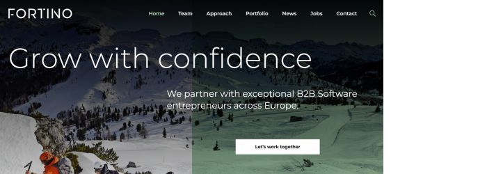
Next up is Fortino Capital’s website, where sleek design meets comprehensive VC insights, all served up in a minimalist but cohesive digital experience.

Design and Branding
First off, Fortino Capital’s website serves up a clean, professional look that's easy on the eyes. The homepage boasts a striking hero section immediately communicating the vision of challenge and aiming for the peak. The entire site has a simple yet effective layout, with a straightforward navigation menu that takes you where you need to go.
Alongside its professional appearance, Fortino Capital’s website also flaunts a colour scheme that's both modern and inviting. The use of visuals is subtle yet effective, creating an atmosphere of sophistication without overwhelming the visitor. The website overall speaks to their expertise and seriousness while leaving room for a modern and approachable vibe. This balance between corporate and creative is one of the things that makes their branding thoughtful and visionary.
VC Elements
In terms of content, Fortino Capital has all the VC staples. There's a clear “Team” and “Portfolio” section laying out their expertise and track record, providing an elaborate glimpse into the collective expertise and international presence of the firm. Through their website elements, they also skillfully tell a story about the kind of companies they believe in and support, giving a sense of the impact they aim to create in the target strategy.
The “Approach” section immediately communicates their investment strategy, detailed in a way that’s both comprehensive and easy to digest. (Rumour has it that if an LP has not figured out what you invest in and how in less than 10 seconds of skimming your website, you could be shelved 😮).
Responsiveness
The website’s responsiveness extends beyond just loading speeds. Its design adapts and extends smoothly to mobiles. Coupled with subtle animations, browsing experience remains seamless.
SEO
Overall, Fortino Capital's website is set up pretty well for Google and other search engines to find and understand it. The meta description and the use of descriptive text for links make for great user accessibility. The pages are open for indexing on search engines, images have alt attributes, and the backend is correctly set up to avoid duplicate content issues.
The titles, crawlable links and a valid sitemap also means that search engines can easily find their way around the pages, a big plus for showing up on Google results. We also found no plugins, which enhances its compatibility and indexing potential across different browsers and devices.
A big thumbs up from us! 👍
This site is created in Drupal.
Did you like this website? Want a similarly beautiful website of your own?
Verdict
Web design is about smart choices and thoughtful branding. Your website being a centrepiece of your value, track record and expertise, your best bet is to have it created by professionals who not only can create effective design elements but those who truly understand your business and the continuity between your brand and your vision.
And this is not a one off thing, your website should be regularly updated with fresh content and news about your activities, nurtured with up-to-date information and maintained on a more technical level.
Crafting a visually appealing, informative website that immediately displays the vision and mission of your VC firm is probably one of the best investments you can make, even from the start of your VC journey. A great digital presence is wholly within reach for VC firms of any size looking to make a big impact.
Looking to build or transform your VC website?
Do you want to get featured in our future Website Series? We'd love to hear from you!
Share this!


